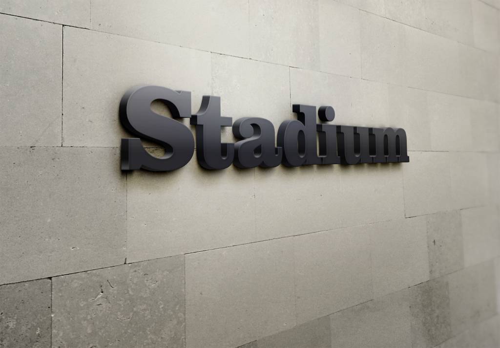
TL;DR: Choosing the right signage font is essential for creating signs that are both attractive and easy to read. The best fonts improve visibility, strengthen branding, and help customers quickly understand your message, whether indoors or outdoors.
- Prioritize readability when selecting sign fonts.
- Sans serif fonts are often among the best fonts for signage readability.
- Indoor signs allow for more stylistic flexibility than outdoor signs.
- The best font types for outdoor signs feature bold, simple letterforms.
- Professional sign designers can help match the best font for signage to your brand and environment.
When designing a sign, elements like color, graphics, and placement often receive much of the attention. However, the signage font you choose can play an even greater role in how effectively your message is communicated. Whether you’re creating an indoor directory sign, storefront display, monument sign, or outdoor wayfinding system, selecting the right font helps improve readability, strengthen brand recognition, and capture attention.
A poorly chosen font can make important information difficult to read, causing potential customers to miss your message altogether. Understanding which sign fonts work best for different environments helps ensure your signage is both functional and visually appealing.
Whether you already have a clear vision or are just starting to explore ideas, Sign Centers can help transform your concepts into eye-catching, effective signage. Before bringing your project to life, let’s explore some key considerations for choosing the right font and ensuring your signage makes the impact you want.
Why Your Signage Font Matters
A well-chosen signage font does more than display words. It influences how people perceive your business and determines how quickly information can be understood.
For example, customers walking through a shopping center may only have a few seconds to read a sign, whereas drivers passing by your business typically have even less time. This is why readability should always be a top priority when selecting signage fonts.
Benefits of choosing the right font include:
- Improved readability from various distances
- Better brand consistency across all signage
- Increased visibility and customer engagement
The fonts you choose shape first impressions, influence customer perception, and reinforce your brand’s personality, while ensuring your signage remains professional, readable, and impactful.
Understanding Readability for Indoor and Outdoor Signs
Readability is one of the most important factors in sign design. The best fonts for signage readability feature clean lines, simple letterforms, and adequate spacing between characters.
Indoor signs are often viewed at closer distances, giving businesses slightly more flexibility with decorative styles. Outdoor signs, on the other hand, must remain easy to read from farther away and under varying lighting conditions.
When evaluating sign fonts, consider:
- Viewing distance
- Lighting conditions
- Sign size
- Speed of passing traffic
- Environmental factors such as weather and glare
The easier your sign is to read, the more effective it will be at communicating information.
Popular Sign Fonts for Indoor Applications
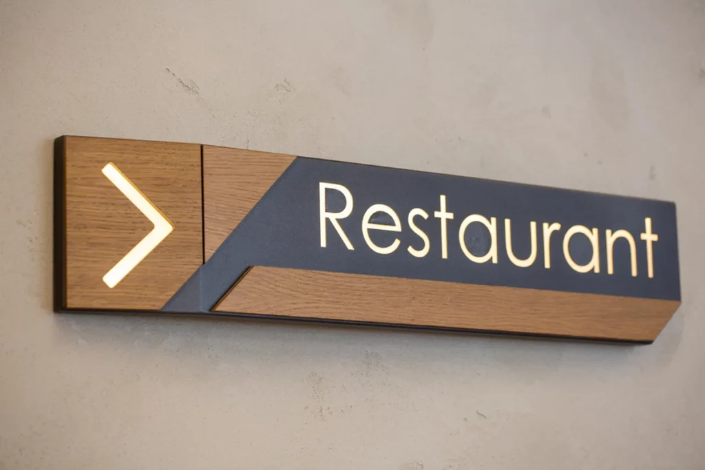
Indoor signs serve a variety of purposes, from welcoming visitors in a lobby to guiding them through office buildings, retail spaces, and other facilities. Since these signs are typically viewed from a closer distance, businesses have more flexibility when selecting a signage font that reflects their brand personality, while still maintaining readability.
Popular choices for indoor signage include several well-established typefaces that offer both style and readability:
- Helvetica
- Avenir
- Futura
- Gotham
- Open Sans
These signage fonts are frequently recommended because they balance visual appeal with functionality. Their clean letterforms and strong legibility make them popular choices for businesses seeking the best font for signage in offices, retail environments, healthcare facilities, and other indoor settings.
Choosing the Best Font Types for Outdoor Signs
Outdoor signage presents unique challenges. Signs must remain legible from long distances, in bright sunlight, during poor weather conditions, and sometimes while viewers are moving.
The best font types for outdoor signs generally feature bold strokes, simple letter shapes, and minimal decorative elements. Sans serif fonts are often preferred because they remain readable even at greater distances.
Popular outdoor sign fonts include:
- Helvetica Bold
- Frutiger
- Clearview
- Arial
- Gotham Bold
These typefaces maintain clarity across a wide range of sign sizes and viewing conditions.
Avoid highly decorative scripts or overly condensed fonts for outdoor applications. While they may look attractive up close, they can become difficult to read from a distance.
Key Characteristics of Effective Signage Fonts
Not every font works well for signage. The most effective fonts are designed to make communication clear, quick, and easy to understand. They should have distinct letterforms so similar-looking characters are not confused, along with enough spacing between letters and words to support readability from different distances.
Strong contrast between the font and background is also important, especially for signs viewed in varied lighting conditions. Simple fonts without excessive decorative details often perform best because they allow viewers to recognize words quickly.
Many of the best fonts for signage readability use balanced proportions and clean shapes to help people absorb the message at a glance.
Matching Fonts to Your Brand Identity
While readability should remain the top priority, your signage should also support and strengthen your brand identity. The best fonts for signage not only ensure your message is easy to read but they also reflect your company’s personality and values.
For instance, a law firm may benefit from a clean, professional typeface that conveys credibility and trust. A modern retail store might choose a sleek, geometric font that highlights innovation and contemporary style. Meanwhile, a family-focused business may opt for a warm, approachable typeface that creates a welcoming impression.
By selecting fonts that balance readability with brand expression, businesses can create a cohesive visual identity across all signage while making information clear and accessible to customers.
Common Font Mistakes to Avoid
Even attractive fonts can become ineffective when used incorrectly. Businesses should avoid common mistakes that reduce visibility and impact.
Some frequent signage font errors include using fonts that are too thin, selecting overly decorative scripts, crowding text together, or combining too many font styles on a single sign.
When in doubt, simplicity is usually the best approach. Many experienced sign designers rely on proven sign fonts that consistently perform well in real-world conditions.
Work with Signage Professionals
Choosing the right signage font involves more than simply selecting a typeface that looks appealing. Factors such as viewing distance, placement, lighting, branding, and readability all influence which font will perform best.
Professional sign experts can help evaluate your specific needs and recommend the best font types for outdoor signs and indoor applications alike. Their experience ensures your signage remains effective, attractive, and easy to read for years to come.
If you’re planning a new signage project, the team at Sign Centers can help you select the ideal fonts, materials, and designs to maximize visibility and brand impact. Get a free estimate today and discover how professionally designed signage can help your business stand out.
FAQs
Which font attracts the most attention?
Bold, clean sans serif fonts typically attract the most attention because they are highly visible and easy to read from a distance. Fonts like Helvetica Bold, Gotham, and Futura create strong visual impact while maintaining excellent readability.
What is the standard font for signs?
Helvetica is often considered the standard font for signs due to its clean design, versatility, and readability. Many businesses and municipalities use Helvetica and similar sans serif fonts because they remain clear across various distances and viewing conditions.